Using a consistent format and structure for course materials
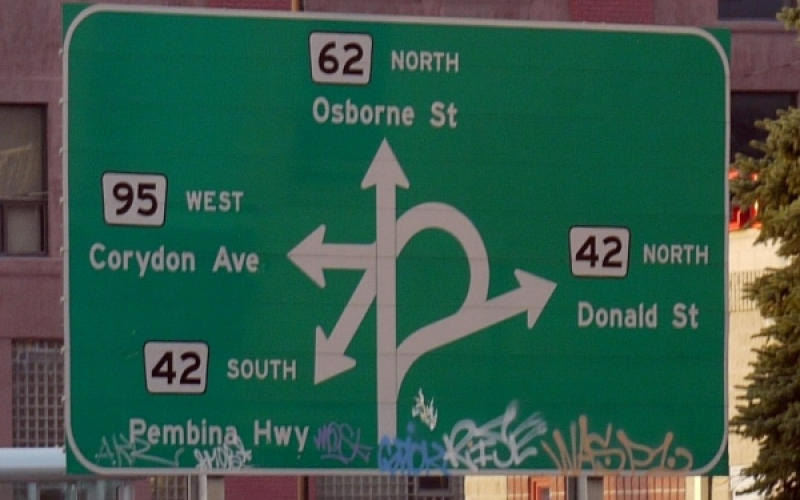
Above: The famous Confusion Corner in Winnipeg, Manitoba. An excellent example of a failure to provide clear visual cues. Photo Credit: Jody McIntyre / CC BY-SA
By Chris Wenz
Even with easy access to GPS directions, we often encounter some...difficulty driving to a new location. We haven’t yet developed a routine, or a set of landmarks and cues to help us get where we’re going: we miss our exit, get stuck in the wrong lane, or drive past the turn we need to make. On top of this, it’s common that the street signs meant to provide us with clear visual cues confusing or poorly placed. Add in some bad weather, traffic and a healthy dose of anxiety and things can go from bad to worse. In these situations we&’re using a lot of mental energy just to find our way and as a result it’s far more likely that even the best drivers and navigators among us will make some (potentially dangerous) mistakes.
We should think about any remote learning situation in this way: students are trying to find their way in unfamiliar territory. Our job as instructors is to provide them with the best directions possible, and provide them with ample cues, landmarks and reminders to help them on their journey. In a traditional classroom, we have the luxury of answering clarifying questions and reminding students of the sequence of tasks, and we can provide lots of visual and verbal cues to help students stay organized and on-task. In an online environment, we don’t have the same opportunities to support students in the moment, so it’s incumbent on us to be intentional and consistent in how we present learning materials to them. Otherwise we risk creating unnecessary confusion and frustration; in other words: we can’t change the weather, or lighten traffic, but we can make sure the streets are well lit and there are signs to guide their way.
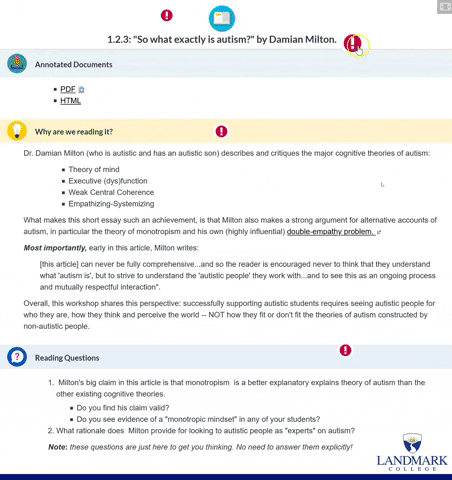
In the interactive graphic embedded below, I use a page from a recent online workshop I taught in order to highlight tips and resources that have helped me improve how I design courses and materials. I am certainly not an expert graphic designer, but I hope you find these resources about how and why to use these design elements helpful.
The topics discussed include:- Using consistent visual design elements like icons, headers and color to provide visual cues and make course pages and documents more readable and supportive.
- Setting up a consistent system for naming course materials to support online navigation and file organization
- The instructional benefits of using consistent design and language
How to use the interactive
Click the red exclamation points and then scroll through the pop-ups. Click the icon in the top right to open in full screen mode. By clicking the embed button at the bottom of the graphic, you can include this interactive on a website or in a slide show; please just be sure to cite or link back to this page. This interactive was created using H5P: a free tool for creating all kinds of engaging HTML content.